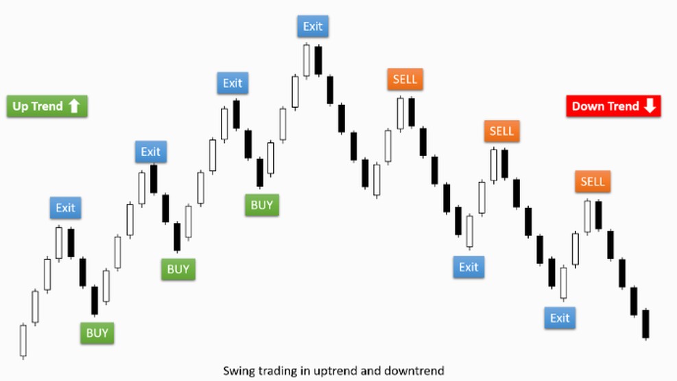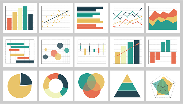
There are three different types of charts:
- Line Charts (Line chart)
- Bar Charts (Bar graph)
- Candelstick Charts (Candlestick chart)
Let's take a look at the charts in detail now….
Line Chart – Line chart
A simple line chart draws a line from one closing price to the next. The resulting line shows us the course of the price of a currency pair over a certain period of time.
Here is an example of a line chart for EUR/USD:
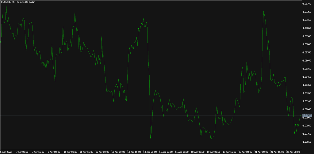
With MetaTrader you can set top left, which period should be displayed in this chart.
Bar Chart
From bar charts, closing prices can also be recognized, in addition, however, opening, Most- and lowest prices are read. The lower end of the vertical bar shows the lowest traded price in the respective period, while the upper end describes the highest traded price. The vertical bar thus indicates the entire range in which a currency pair was traded.. The horizontal dash on the left side of the bar shows the opening price and the dash on the right shows the closing price.
Here is an example of a bar chart for USD/CAD:
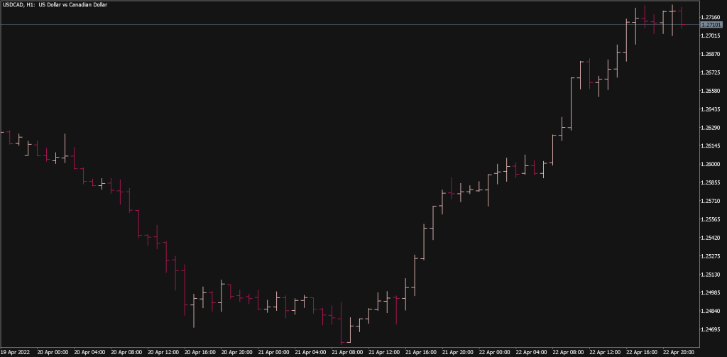
A bar describes a specific period of time. This can take a day, one week, be an hour or even less. When you hear the word bar, you should always know which time window it refers to.
Bar charts will also be “OHLC” Charts called, because they open the- (Open), the maximum- (High), the lowest- (Low) and the final price (Close) of the respective currency pair.
Here is an example of a price bar:
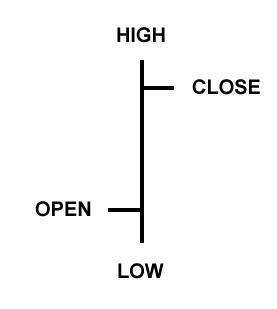
Open: The small line on the left is the opening price.
High: The upper end of the vertical line defines the highest price in this period.
Low: The lower end of the vertical line shows the lowest price in this period.
Close: The small dash on the right side is the final price.
Candlestick Charts
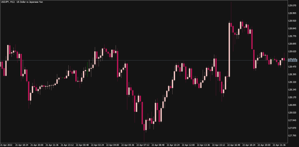
The question now arises which type of graphical representation is most helpful to us when analyzing charts. What should a diagram look like?, so that we can get the information as quickly and reliably as possible in order to be able to trade successfully on the FOREX market? In the chart analysis, the candlesticks have prevailed. In the following you will learn what they consist of and what the different patterns tell us.
Summary
Depending on the intended use, other types of diagrams can also be used. Economic reports are usually presented in tabular form (COT Report) published. Without charts, these numbers are difficult or impossible to interpret. Meaning of a chart or chart as we like to call charts, is to visualize a market situation and thus provide a better insight.
